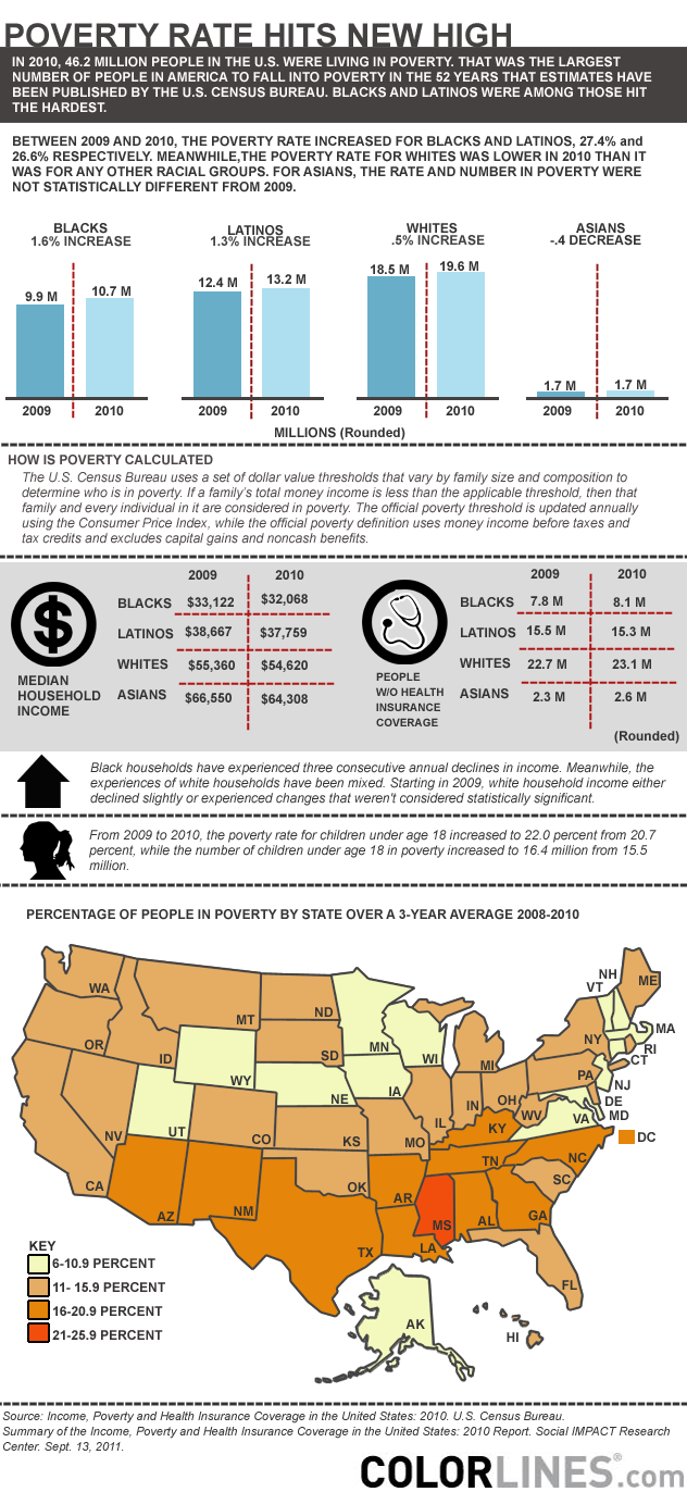
Poverty Rate Hits New High As Racial Inequality Deepens
Here’s my latest infographic for Colorlines on current U.S. poverty rates based on the latest statistics from the Census Bureau. This graphic only scratches the surface of poverty and people of color affected. A more interesting look would be to dive down into the city data. The Guardian used the same poverty data and incorporated it into Google Fusion Tables to make an interactive graphic. It’s a big wonky to use but still a good visual.
Click to view in Colorlines.

